You are using an out of date browser. It may not display this or other websites correctly.
You should upgrade or use an alternative browser.
You should upgrade or use an alternative browser.
New 2022-2023 Barca kits
- Thread starter Jefecito
- Start date

soul24rage
Senior Member
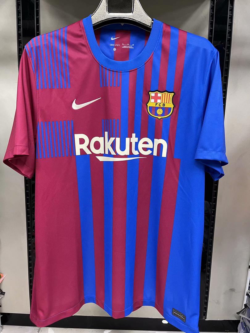
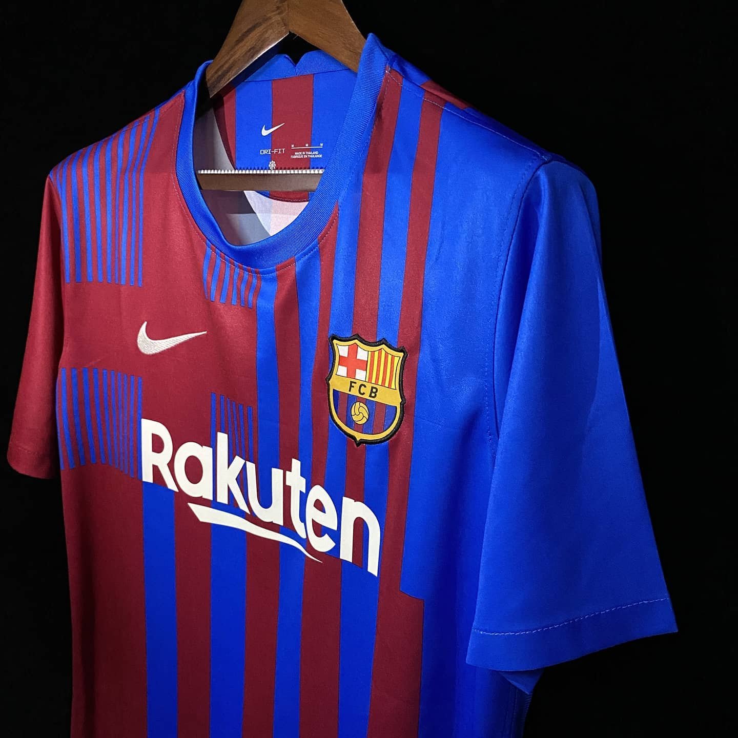
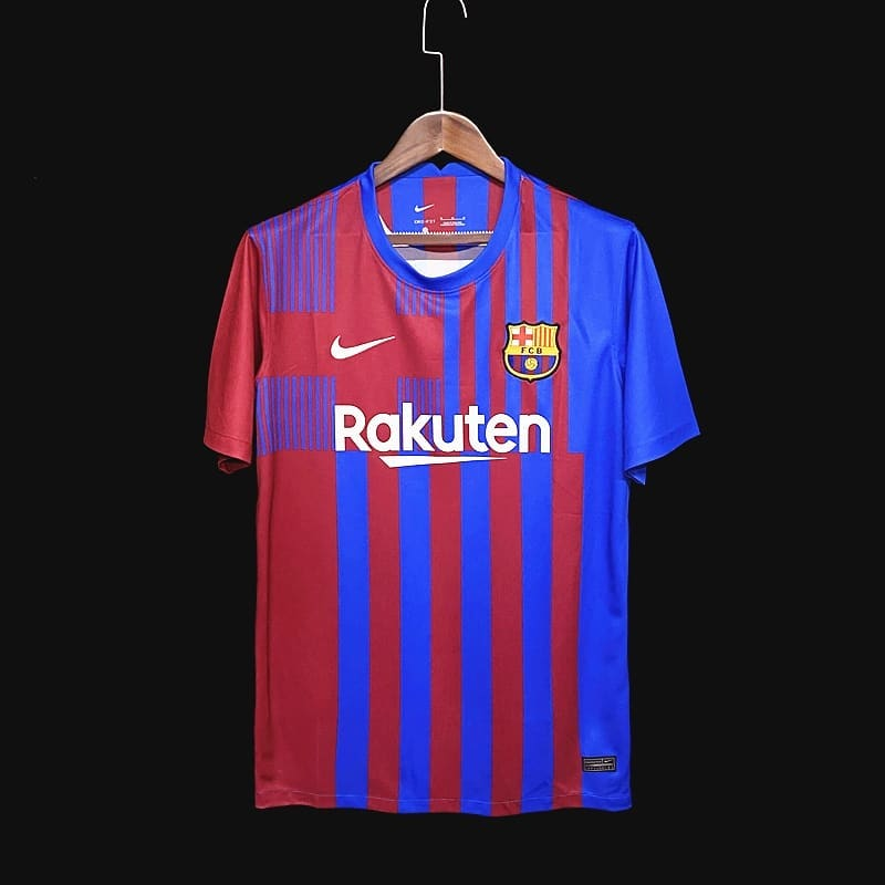
Wish the colors were darker in shades like the 12/13 and 14/15 jerseys
te amo barca
Blaugrana al vent
Really hate the dark shading, an ugly kit.
Luis Suarez
Member
Anyone a graphics designer here? Why is there more red in the lower right of the jersey? Wouldn't it be more aesthetically pleasing to have the same blue and red stripes uniformly throughout the lower half.
Last edited:
Luftstalag14
Culé de Celestial Empire
I am liking the red sleeve - blue sleeve design but the shades are too light and overall it looks too Segunda-ish to me. Huesca and Levante have darker shades and theirs look pretty good, this is almost like Crystal Palace shades.
Make them darker Nike!
Make them darker Nike!
Luftstalag14
Culé de Celestial Empire
Anyone a graphics designer here? Why is there more red in the lower right of the jersey? Wouldn't it be more aesthetically pleasing to have the same blue and red stripes uniformly throughout the lower half.
Because they have to accommodate the position of St. Jordi's cross above and make sure the stripes line up. Personally I am OK with the asymmetrical design, it doesn't bother me.
Luis Suarez
Member
Because they have to accommodate the position of St. Jordi's cross above and make sure the stripes line up. Personally I am OK with the asymmetrical design, it doesn't bother me.
Would have preferred the St. Jordi's by itself, without the thin blue and red lines around it.
https://www.footyheadlines.com/2020/09/fc-barcelona-21-22-home-kit.html
Birdy
Senior Member
Design is awesome.
Agree about the shades. IMO either make it like 08/09 shades (standard red and blue) or go darker.
Indeed that particular shade of blue combined with that particular shade of red makes us look like crystal palace.
Whereas the lighter blue and darker red in the leaked version of a Barca hat by FootyHeadlines makes a better color combination:
https://www.footyheadlines.com/2020/09/fc-barcelona-21-22-home-kit.html
Don't like the beige -whatever shade it is - of Rakuten and Nike. It will be also on the player numbers.
Yellow or Gold should always be there.
Home of Barca Fans
